

Visualizations That Tell Stories, Not Just Show Numbers

We design data visualizations that tell stories — not just display numbers. Interactive, insightful and designed for decision-making at every level.

Power BID3.jsPlotlyFigma
Book a free consultation
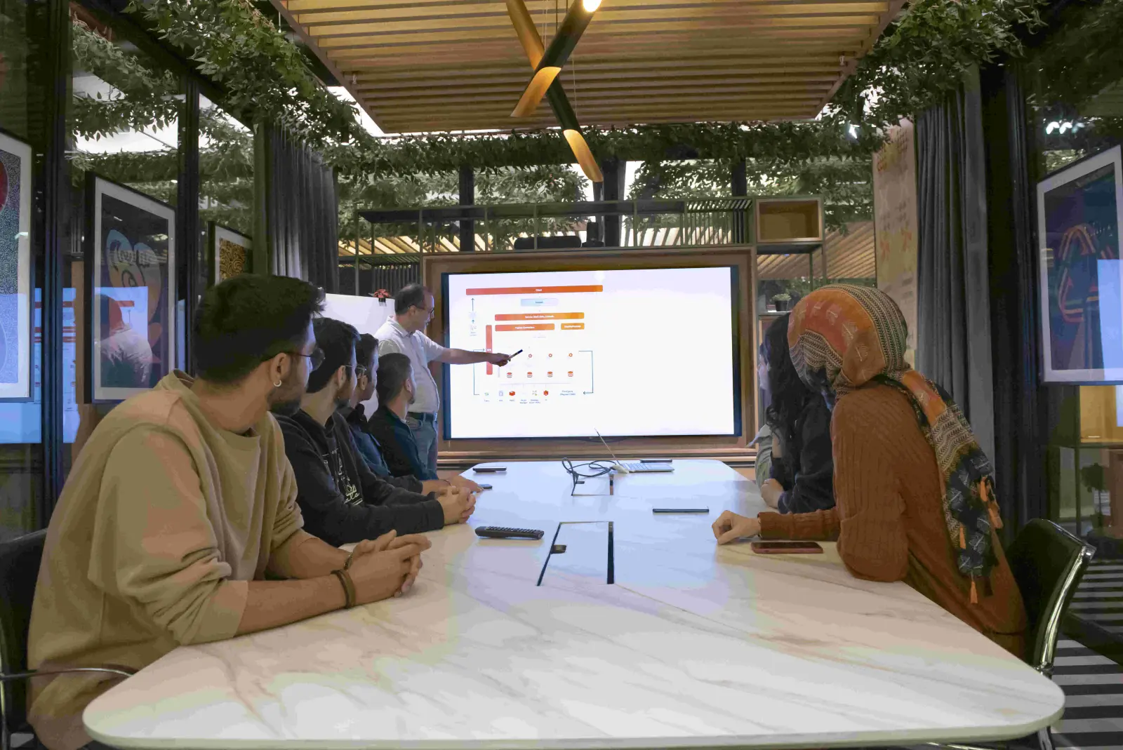
Deka Technology engineers working on data visualization projects
500+
Dashboards designed
85%
User adoption rate
< 3 sec
Dashboard load time
70+
Enterprise clients
THE CHALLENGE

Dashboards nobody uses

Most enterprise dashboards fail not because of bad data but because of bad design. They show too many metrics, use inappropriate chart types, bury insights in tabs that nobody clicks, and take 30 seconds to load. The result: executives ignore the dashboard and ask analysts to build yet another PowerPoint.

Good data visualization is information design, not chart decoration. Every element on screen should answer a question, highlight an anomaly or prompt an action. If it does not, it should not be there.

OUR APPROACH
01

Understand & Define

We interview stakeholders to understand their questions, decisions and workflows. Dashboard design starts with the decisions it must support.

02

Design & Build

Information architecture, visual hierarchy and interaction design. Every visualization is tested with real users before full rollout.

03

Deploy & Iterate

Deployment with usage analytics. We track which dashboards are used, which pages are ignored, and iterate based on actual behavior.

CAPABILITIES

What we deliver

Executive Dashboards

One-page KPI summaries designed for 30-second consumption. Traffic-light indicators, trend sparklines and exception highlighting — the board sees what matters without clicking.

Operational Displays

Real-time dashboards for operations: production floors, call centers, logistics hubs. Large-screen optimized, auto-refreshing, alerting on thresholds.

Interactive Analytics

Drill-down dashboards that let users explore data at their own pace. Filters, cross-highlighting and bookmarks for ad-hoc analysis within a governed framework.

Custom Visualizations

D3.js and custom chart components when standard charts fall short. Network graphs, Sankey diagrams, geographic maps and domain-specific visualizations.

Mobile-Optimized Reports

Responsive dashboard design for tablets and phones. Field managers and executives see their KPIs on any device, anywhere.

Executives ignoring your dashboards or asking for Excel exports?

Talk to a visualization specialist who designs for decision-making.

Discuss your project
500+
Dashboards designed
85%
User adoption rate
< 3 sec
Dashboard load time
70+
Enterprise clients
PROJECT SPOTLIGHT
DATA VISUALIZATION

Anadolu Efes

CHALLENGE

Executives received 40+ weekly reports as email attachments. No interactive exploration, no real-time data, no mobile access.

APPROACH

We designed an executive dashboard suite: 6 pages covering sales, operations, finance and supply chain. Real-time refresh, mobile-optimized, with drill-down to regional and product-level detail.

RESULT

Weekly report emails eliminated. Executives access real-time KPIs on any device. Decision meetings are now data-driven, not report-driven.

40+ reports replacedReal-time refreshMobile-ready
USE CASES

Where we apply it

  • Give the board a one-page KPI view that loads in 3 seconds
  • Monitor production and logistics in real time on large screens
  • Visualize the sales pipeline so forecasts become reliable
  • Map geographic and network data with custom D3.js charts
  • Embed analytics directly inside your enterprise applications
TECHNOLOGY

Technologies

Power BID3.jsPlotlyFigmaDAXPythonReactSVG
TECHNOLOGY PARTNERS
Microsoft Microsoft
FAQ

Common questions about data visualization

How is your approach different from standard dashboards? +

We start with the decisions the dashboard must support, not the data available. Information hierarchy, visual encoding and interaction design follow communication principles — not just chart defaults. Every element earns its place on screen.

Do you only work with Power BI? +

Power BI is our primary platform for enterprise analytics, but we also build custom visualizations with D3.js, Plotly and React for specialized needs — geographic maps, network diagrams, real-time monitoring displays.

How do you measure dashboard success? +

Usage analytics: daily active users, page views, filter interactions and time spent. A dashboard that is not used is a failed dashboard. We iterate based on actual behavior, not assumptions.

Can you redesign our existing dashboards? +

Yes. We audit existing dashboards for usability, performance and data accuracy. Often a redesign of the same data with better information architecture doubles adoption.

Discuss your specific setup →

Related case studies

View all →
DATA & BI
Enterprise analytics with Power BI
Anadolu Efes
DATA & BI
Advanced monitoring & analytics
Bulutistan

Let's build something that works.

No commitment. Just a clear conversation about your project.

Discuss your project